45.12 CSS Grid and Flexbox
Flexbox
- Flexbox stands for flexible box.
- It's a layout module for CSS aimed at giving you an efficient way to arrange, organize, and size website elements to create highly adaptive designs.
- Responsive and mobile friendly
- Makes positioning child elements much easier
- When using flex, the container's margins do not collapse with the margins of its content
- The order of elements can easily be changed without altering the HTML code
- Can easily alter and control item width and height to best fit within the parent container
- Flexbox is direction agnostic
- It is best for small-scale layouts
- One-dimensional unlike Grid which is two-dimensional. Flex items can flow along the main-axis only.
Concepts and Terminologies
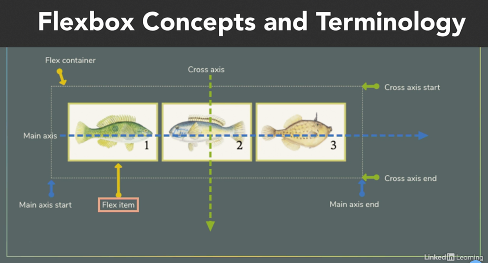
- Flexbox Axis:
- Flexbox operates in a two-axes system: a main axis and a cross axis.
- The main axis is your defining direction of how your flex items are placed in the flex container, and the cross axis is the direction that's perpendicular to your main axis.
- Flex Containers:
- There are multiple properties of a flex container:
- flex-direction
- The direction of flex can be row or column.
- However, you can reverse the order of the elements in either one.
- row, row-reverse, column, column-reverse
- flex-wrap
- flex-wrap tells the parent flex container whether its flex-item children wrap to new lines.
- wrap, no-wrap, wrap-reverse
- flex-flow
- A combined property for both flex-direction and flex-wrap
- It's a shorthand syntax to make things easier:
- flex-flow: column wrap;
- flex-flow is equal to writing:
- *flex-direction:column;
- *flex-wrap:wrap;
- It produces the result of both.
- justify-content
- This is like justification included in most text editors. With flexbox, we justify the flex items on the main axis.
- flex-start, flex-end, center, space-around, space-between, space-evenly
- align-items
- Same as justify-content , but works on the cross axis.
- stretch, center, flex-start, flex-end, baseline
- align-content
- If you have used the flex-wrap:wrap property on the container, you can use align-content to align the items as a unit.
- flex-start, flex-end, center, space-around, space-between, space-evenly
- flex-direction
- There are multiple properties of a flex container:
- Flex Items:
- The children items inside a flexbox are called flex elements or flex items.
- In addition to flexbox, properties called on the parent to alter the display.
- We can also customize individual flex items with the following properties:
- order
- The order property controls the order in which elements appear in the flex container.
- With flexbox order, you can change the order of your DOM elements without actually moving them in your DOM.
- flex-grow and flex-shrink
- These properties allow us to change the way that available space is distributed among our items.
- This concept of available space is also important when we look at aligning items.
- flex-basis
- flex
flex shorthand- flex [max] [min] [ideal size];
- default: 0 1 auto;
- flex flex-grow flex-shrink flex-basis
- align-self
- align-self: auto Il flex-start Il flex-end Il center Il baseline Il stretch
- order
Grid
- Grid is a precise measurement tool used to position design elements on a page.
- CSS Grid is a two-dimensional positioning layout system in CSS that can be used to create responsive interfaces for the web.
Grid vs Flexbox
| Grid | Flexbox |
|---|---|
| Two-dimensional layouts | One-dimensional layouts |
| Works from layout-in | Works from content-out |
| We create the grid on the parent | We create the grid on the children |
| Allows us to occupy same space | Can use in rows or columns |
| Can fully control negative space | Good for distributing space |
Concepts and terminologies
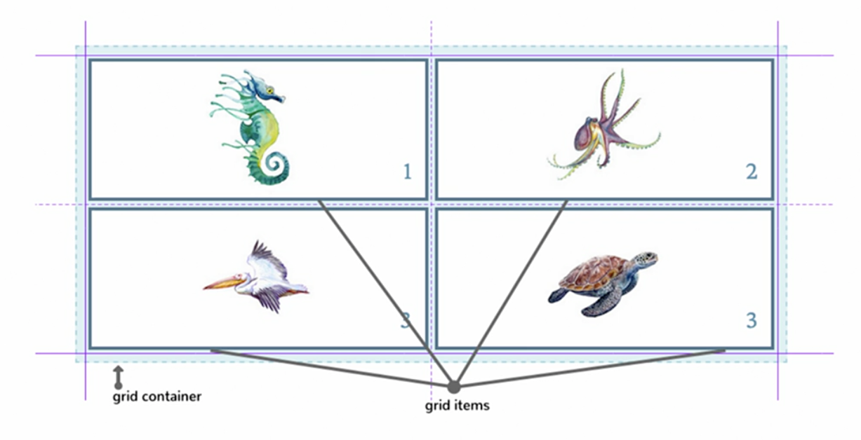
- The explicit grid is the grid that you define with the various grid properties.
- The implicit grid is automatically generated when items are positioned outside the explicit grid.